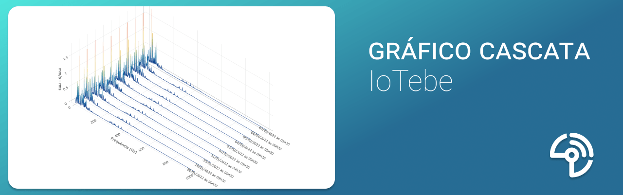
What is a Waterfall Chart?
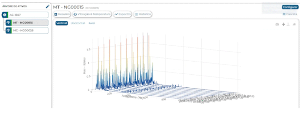
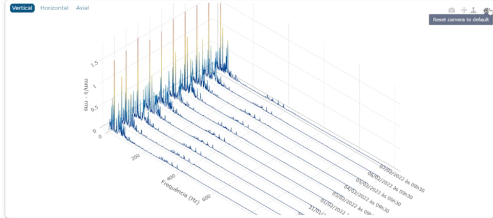
The Waterfall Chart (or Spectral Waterfall) is an interactive 3D chart that allows you to visualize a sequence of spectral data collected by smart vibration and temperature sensors Tebe NXG . In other words, the graph shows the evolution of a series of spectra from the same monitoring point at different times. This provides a better understanding of trends in the spectra over time, making it possible to identify the onset of premature failures and/or changes in the equipment’s operating condition in terms of frequency bands. Thus, it is possible to intervene at an early stage in order to prevent unexpected asset downtime.
Function
With this feature, you can track:
- Level progression within a specific band
- the generation of harmonics; and
- variations in the fundamental frequency of rotating machinery
In short, the Waterfall Chart is a very useful tool for analyzing whether the machine’s behavior is changing over time. For example, if at a given moment the first harmonic has the highest amplitude and, after a few days, the third harmonic begins to be the highest, it means that the machine’s dynamic behavior is undergoing a change.
Another very interesting and critical application is the detection of resonances in equipment. Industrial fans equipped with variable-speed drives, for example, may exhibit prominent frequencies that vary with changes in the equipment’s rotational speed, which is a strong indication that the equipment’s natural frequencies are being excited.
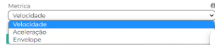
The trends that can be observed in the spectrum are those of the signal envelope, the acceleration spectrum, and the velocity spectrum.
Common issues identified for each metric.
Envelope: rolling and meshing.
Acceleration: bearing, gear, and inadequate lubrication.
Speed: misalignment, imbalance, and play.
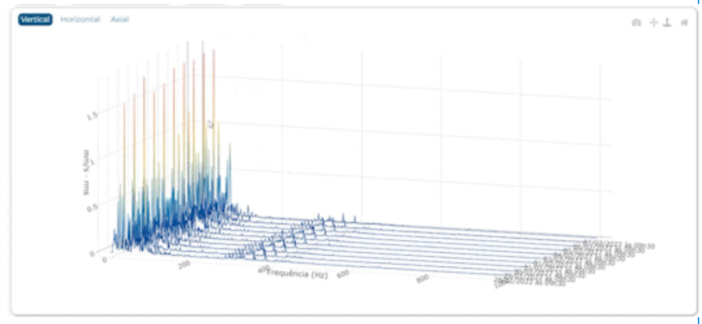
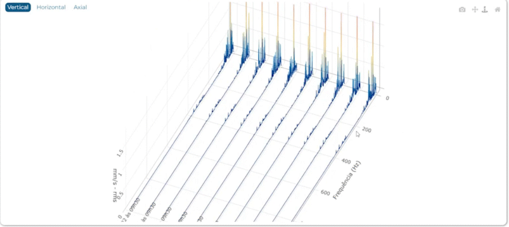
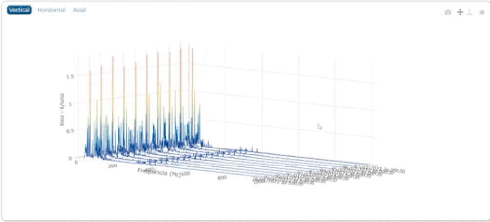
Cascata Resources on IoTebe
Zoom in and out
To zoom in or out on the graph, simply scroll with your mouse. This feature is not available on smartphones.
Rotate
Get a broad overview of each spectrum and choose the view that best illustrates the failure mode. To rotate the graph, select the corresponding icon and move the cursor while holding down the left mouse button.
Drag
Download chart
To download the image to your device in PNG format, click the camera icon. The download will start automatically.
Return to the default view
If you want to return the chart to its original position, click the home icon.
Tags
To further streamline the work of maintenance teams in diagnosing faults, the charts use different color scales based on the intensity of the metrics, as well as markers that follow the cursor.
Want to see the chart in action?
If you aren't already a customer, schedule a free demo and see the software in action! If you already are, visit the IoTebe platform and follow the steps below to take advantage of the update.
How to access
The tool can be accessed on IoTebe from any device (computers, smartphones, and tablets). Just follow these steps
1 – Select the sensor you want to monitor in the Asset Tree.
2 – Click “Spectrum,” then click “Cascade.”
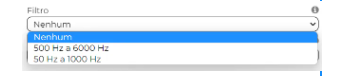
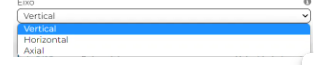
3 – In the window that opens, select which filter to apply.
4 – Select the metric you want to view.
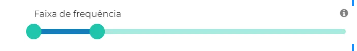
6 – Drag the slider to set the frequency range.
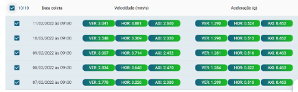
7 – Select up to 10 spectra you want to view and click “Open graph.”